

How to Choose the Right Brand Colours
Or: Why Colour Is Doing More Work Than You Think (and Why My Cat Proves It)
I love colour.
Not in a loud, chaos-for-the-sake-of-chaos way. I love colour the way a good editor loves words. Purposefully. With restraint. With an understanding that what you don’t say matters just as much as what you do.
I also love white space. Deeply. White space is the pause between thoughts. It’s the negative space that lets meaning breathe. It’s the reason good design feels calm instead of desperate.
Clunky, outdated systems that don't talk to each other. Processes so broken you wonder if the people who designed them ever actually used them. Data lost in the shuffle. Customers left waiting. Staff left frustrated. That was the reality.
Which is why I’m going to say this plainly, without apology or hedging:
I do not like black backgrounds on websites or labels.
There are exceptions. There are always exceptions. But “because it looks cool” is not one of them.
That said, there is one black-and-white combination I fully support, unequivocally.
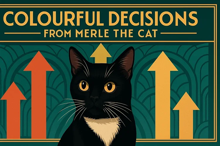
Meet Merle.
Merle is my new cat. He is mostly black, with a small, deliberate amount of white. And crucially, that white is not everywhere. It’s intentional. It’s balanced. It exists in relationship to the black, not in competition with it.
In other words, Merle understands brand colour psychology better than most businesses.
Colour Is Not Decoration. It’s Communication.
When people talk about brand colour selection, they often frame it as taste.
“What colours do you like?”
“What feels right?”
“What’s trendy right now?”
That’s the wrong starting point.
Colour is one of the fastest ways your brand communicates before a single word is read. It signals trust, energy, restraint, confidence, warmth, authority, or chaos. Often all at once.
Brand colour psychology isn’t mystical. It’s behavioural. People have learned, over time, to associate colours with signals:
Blues tend to communicate stability, trust, and calm.
Greens often suggest growth, health, or balance.
Reds can energize, provoke urgency, or signal danger.
Yellows can feel optimistic, playful, or exhausting if overused.
None of this is new. What is new is how often brands ignore context and pile everything on at once.
This is where white space matters.
White space is not empty. It’s a decision. It tells the viewer where to look, what matters, and when to rest.
Merle has white where it counts. Not everywhere. That’s the point.
The Black Background Problem
Black backgrounds have become a design crutch.
They’re often used to signal “premium,” “bold,” or “modern,” but in practice they frequently do the opposite. They reduce readability, increase eye strain, and flatten hierarchy. Everything becomes loud. Nothing stands out.
Black works best when it’s supporting something else, not when it’s swallowing the entire experience.
Merle isn’t a black void. He’s black with contrast. The white gives his form definition. Without it, you’d just have… a silhouette.
If your website feels like a silhouette, that’s not edgy. That’s unclear.
Colour Trends Are Real. Blindly Following Them Is a Trap.
Brand colour trends come and go. Right now we’re seeing a lot of:
Muted earth tones
Soft neutrals
Vintage-inspired palettes
Hyper-saturated “tech optimism” colours making a comeback
Trends are useful as signals of cultural mood. They’re terrible as instructions.
The question is not “Is this colour popular?”
The question is “Does this colour reinforce what my brand is trying to say?”
Merle doesn’t care about trends. Merle is timeless. He would have worked in 1995, and he’ll work in 2045. That’s because his palette is honest. It fits who he is.
Your brand colours should do the same.
How to Actually Choose the Right Brand Colours
Here’s the practical part.
Start with identity, not aesthetics.
Ask yourself:
What do I want people to feel when they encounter this brand?
What level of energy is appropriate?
How much trust needs to be established immediately?
Where should restraint show up?
Then build a palette that includes:
A primary colour that carries the emotional weight
One or two supporting colours that add dimension
A neutral that allows everything else to breathe
And please, for the love of clarity, leave room for white space.
White space is not a lack of confidence. It’s proof of it.
Final Thought (From Merle, Probably)
Merle doesn’t try to be everything. He doesn’t shout. He doesn’t overcomplicate. He shows up exactly as he is, and the balance does the work for him.
Good brand colour selection works the same way.
Use colour with intention. Respect space. Let contrast do its job. And remember that the goal isn’t to impress everyone. It’s to resonate with the right people.
Also, if you’re going to do black and white, do it properly.
Merle approves.
If you want help making thoughtful, lasting choices for your brand, let’s connect.